case Study
Số Đỏ & Nghĩa
A connected branding system for Số Đỏ and its extension Nghĩa, designed for a Vietnamese snack brand and street-style drink experience.
Year
2024
Client
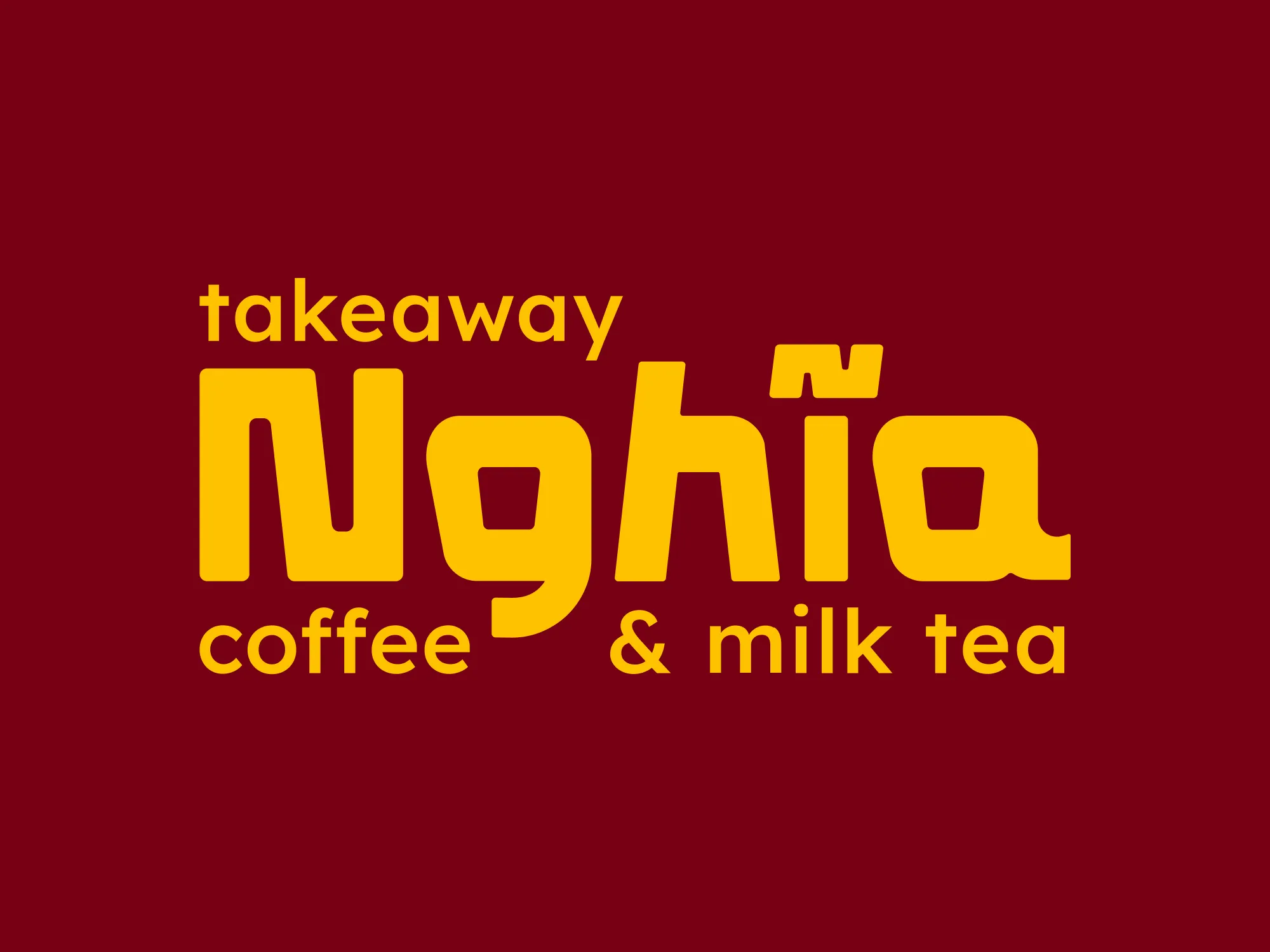
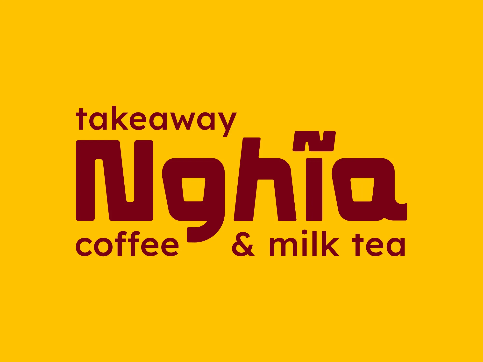
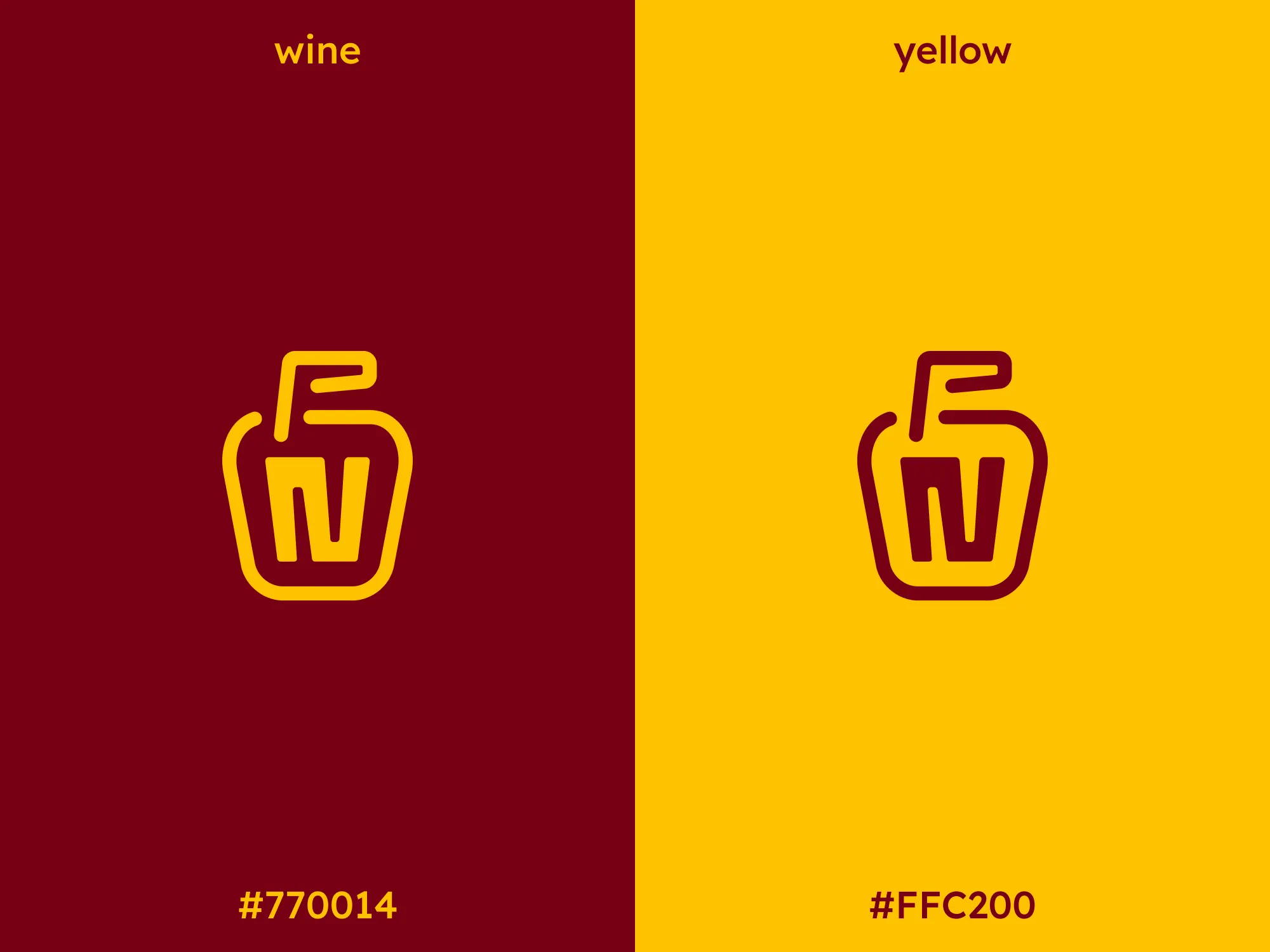
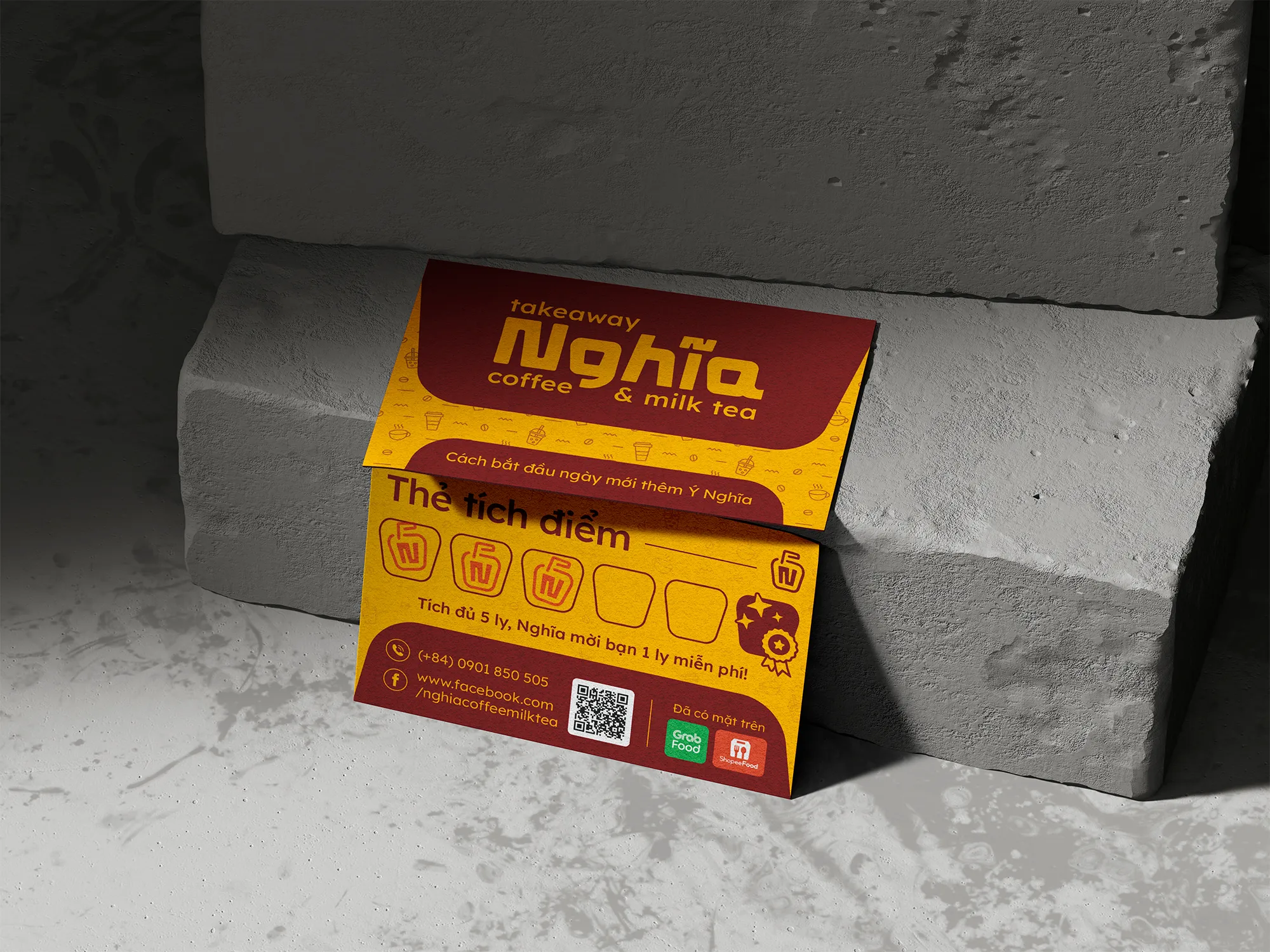
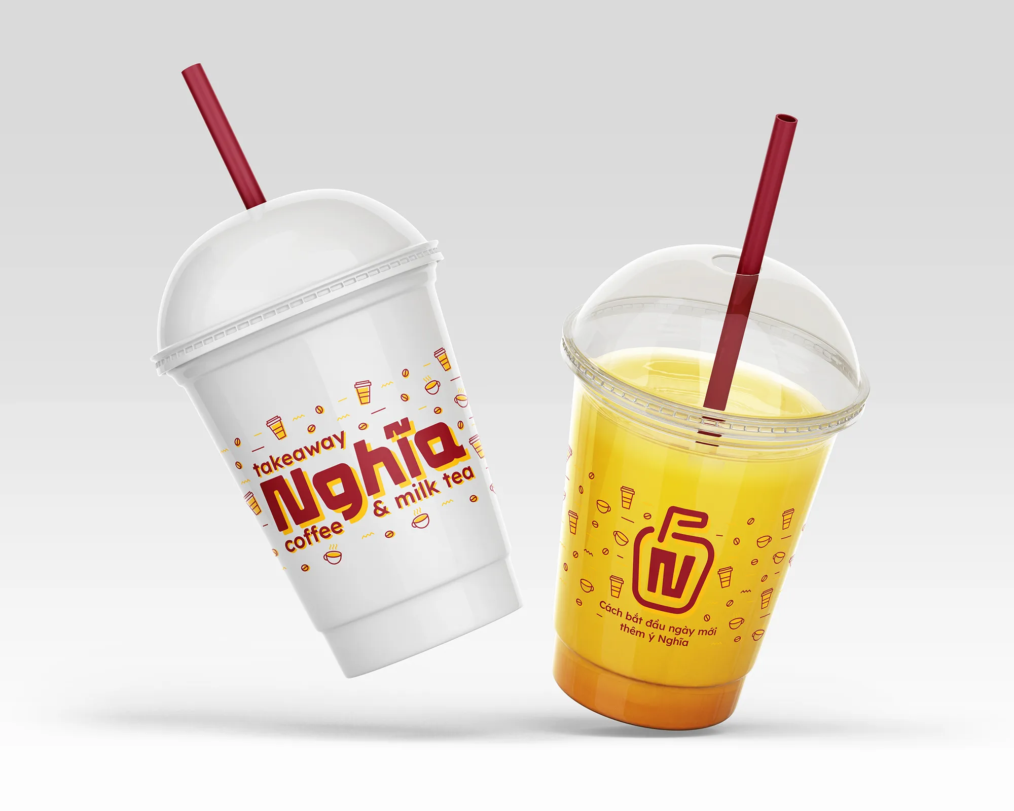
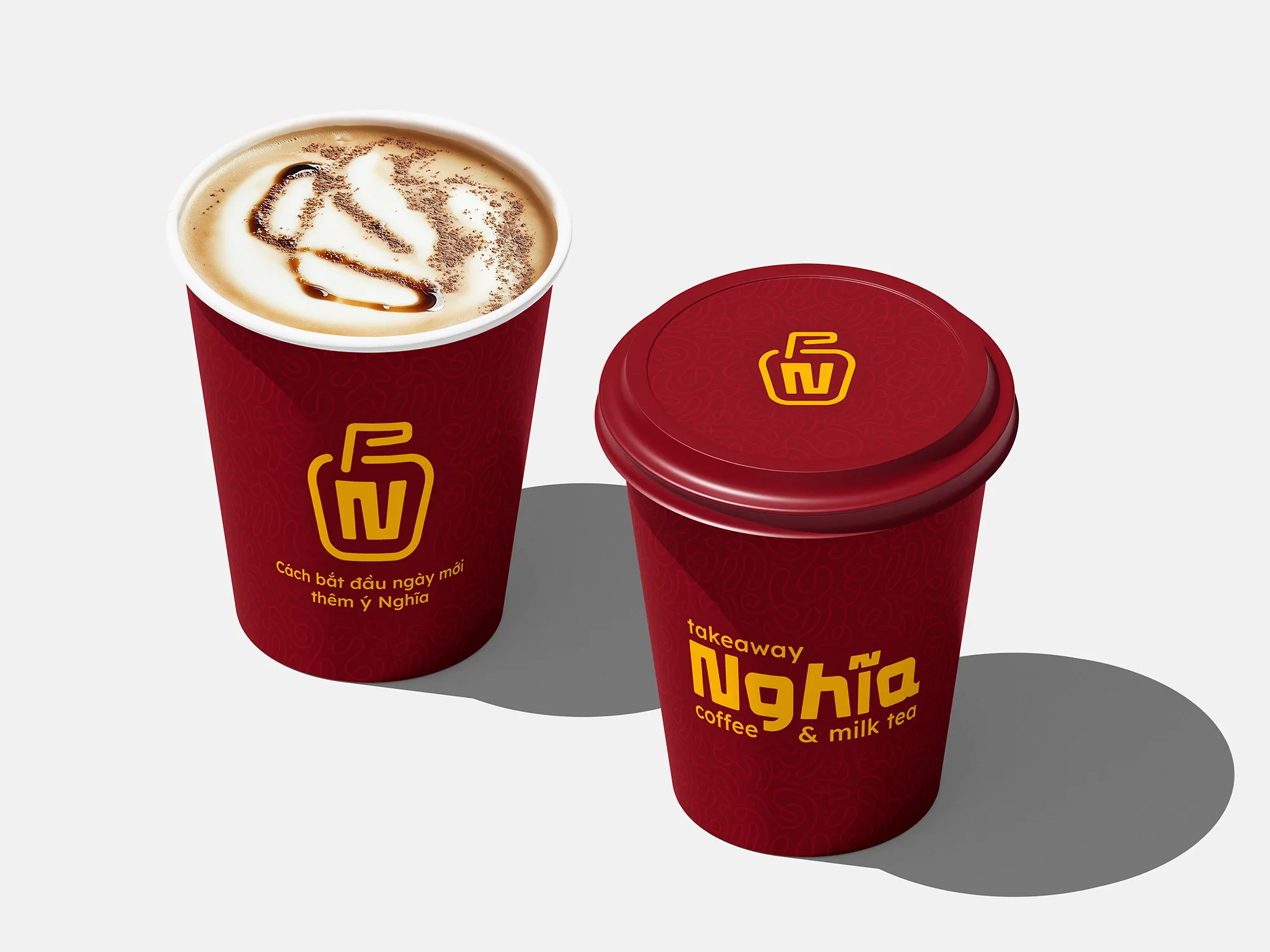
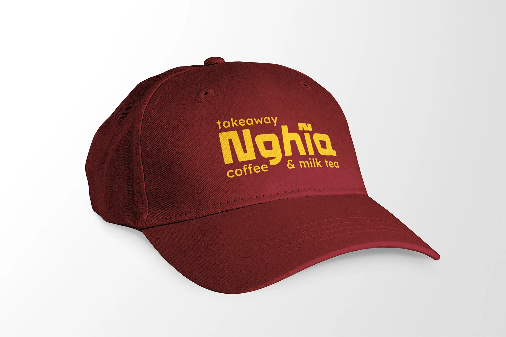
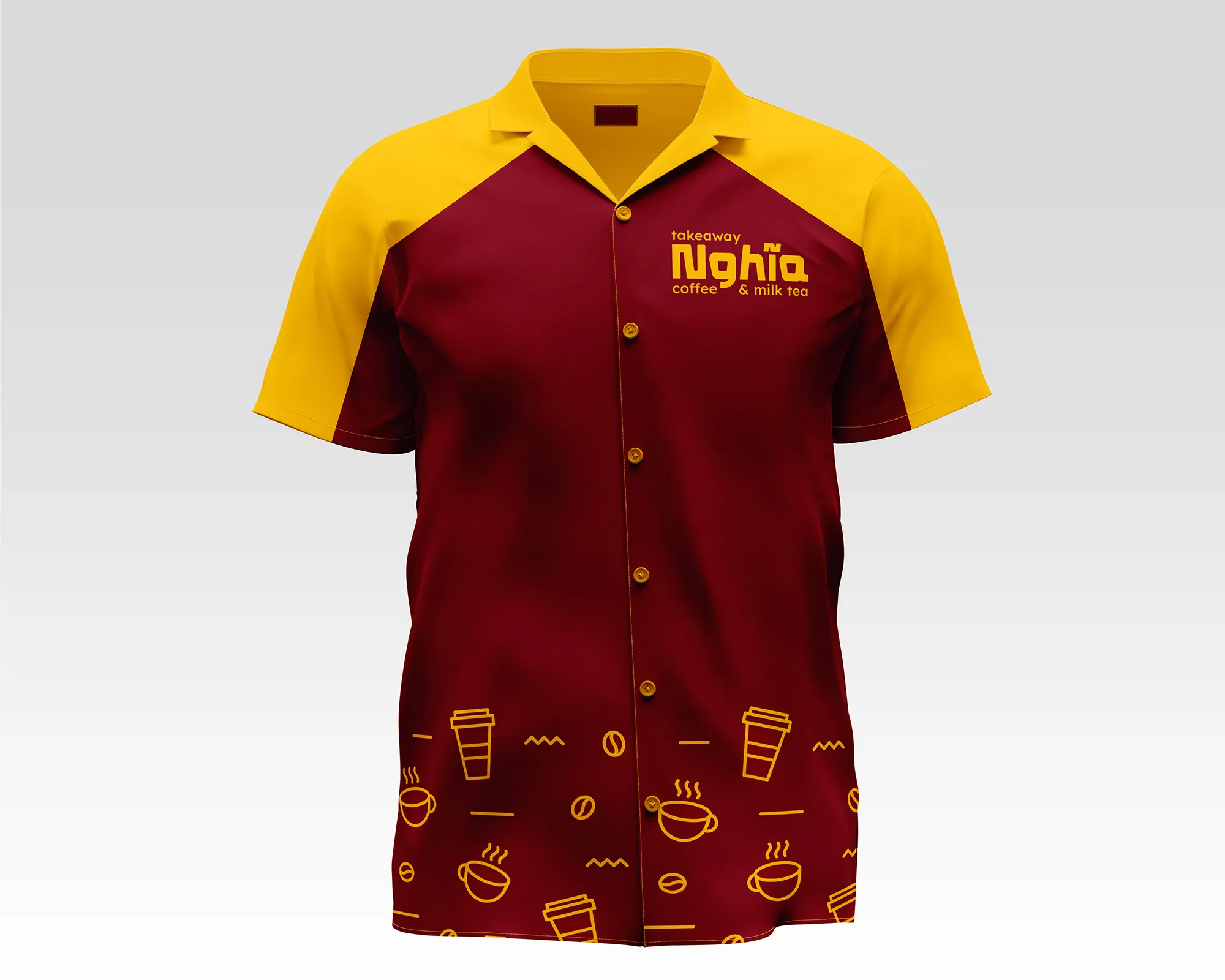
Nghĩa Coffee & Milk Tea
Scope of Work
Visual Identity
•
Rebranding
A connected branding system for Số Đỏ and its extension Nghĩa, designed for a Vietnamese snack brand and street-style drink experience.
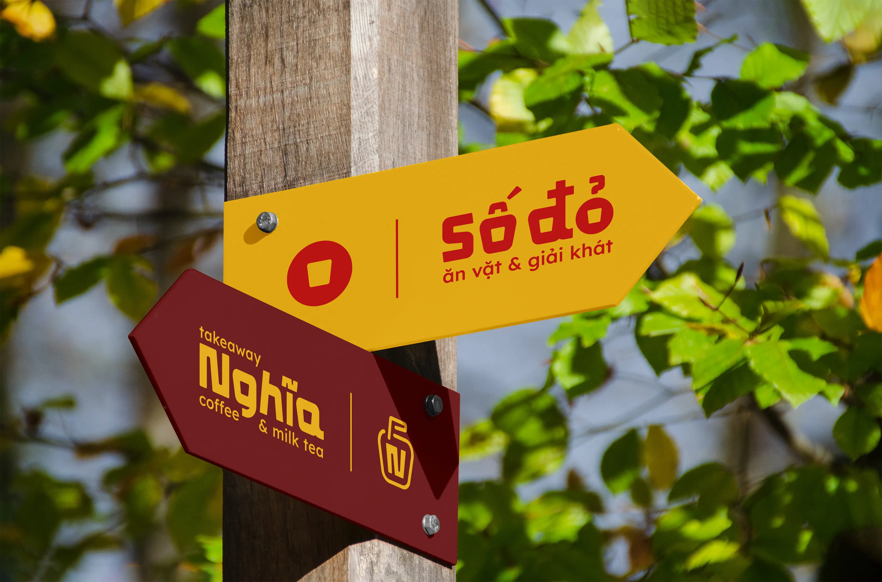
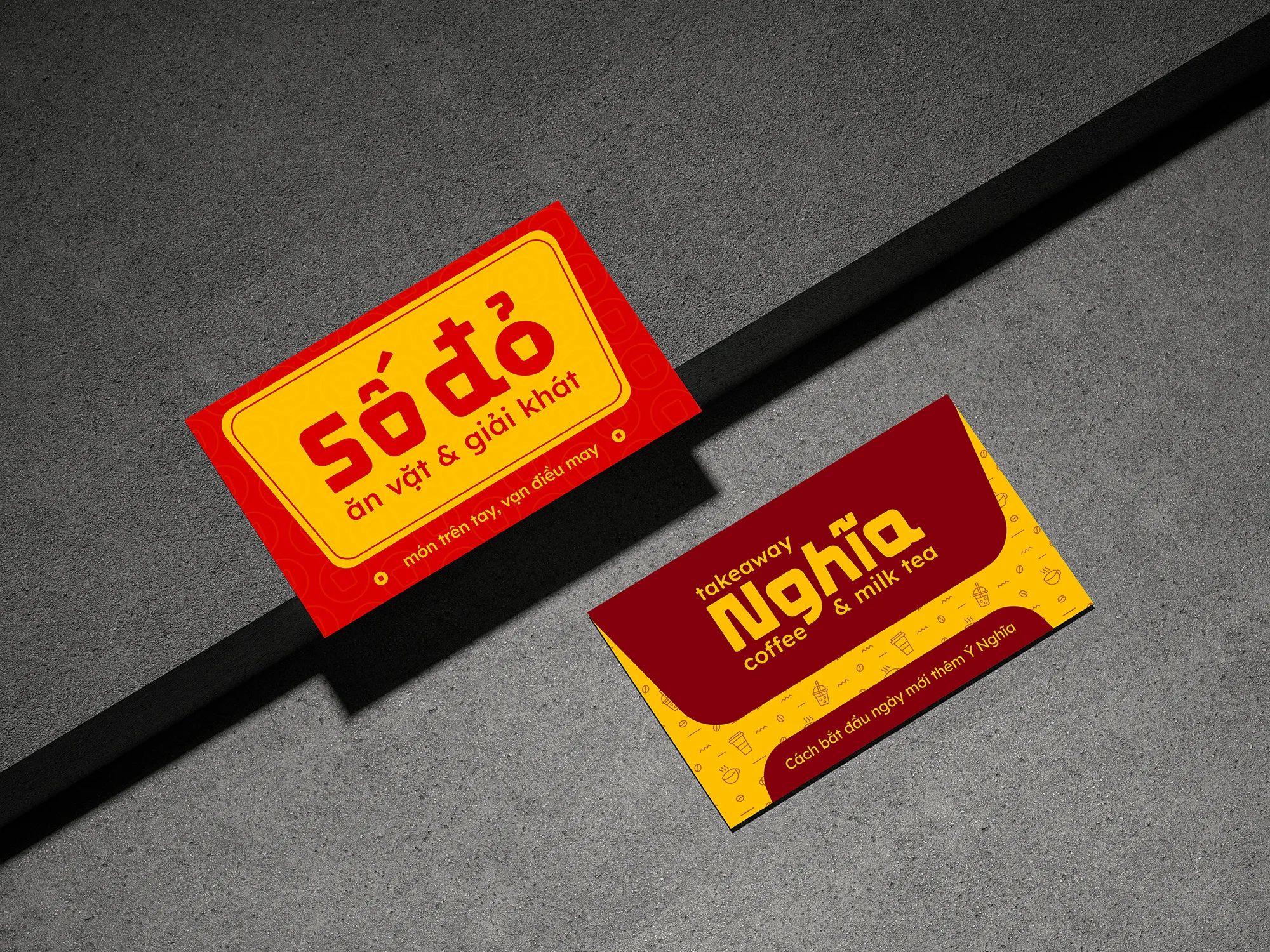
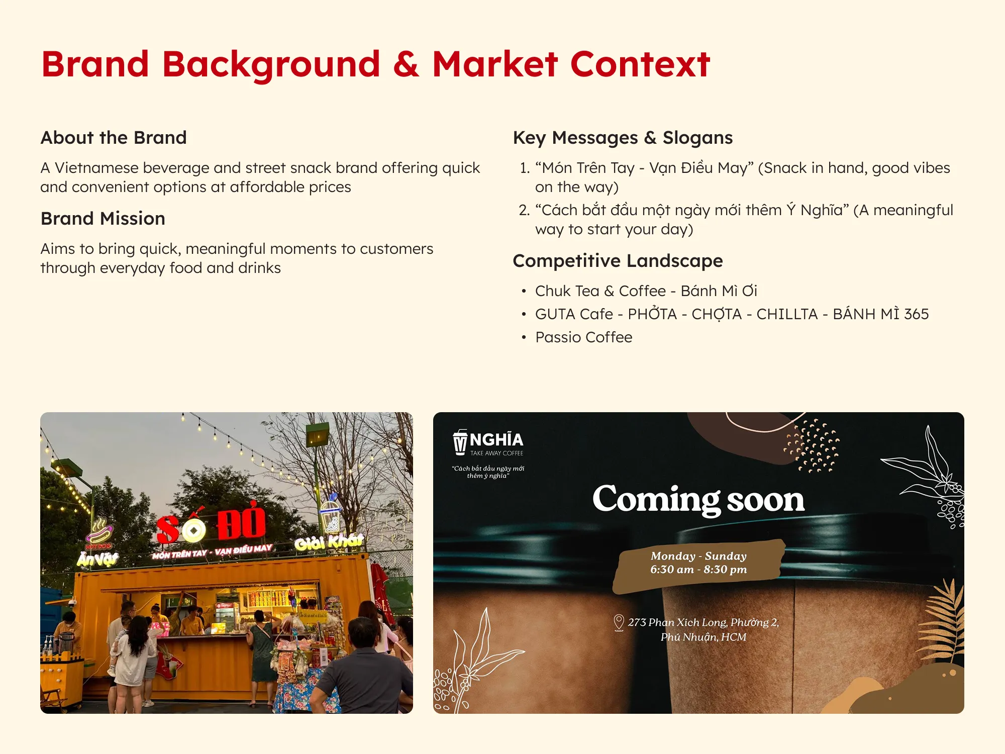
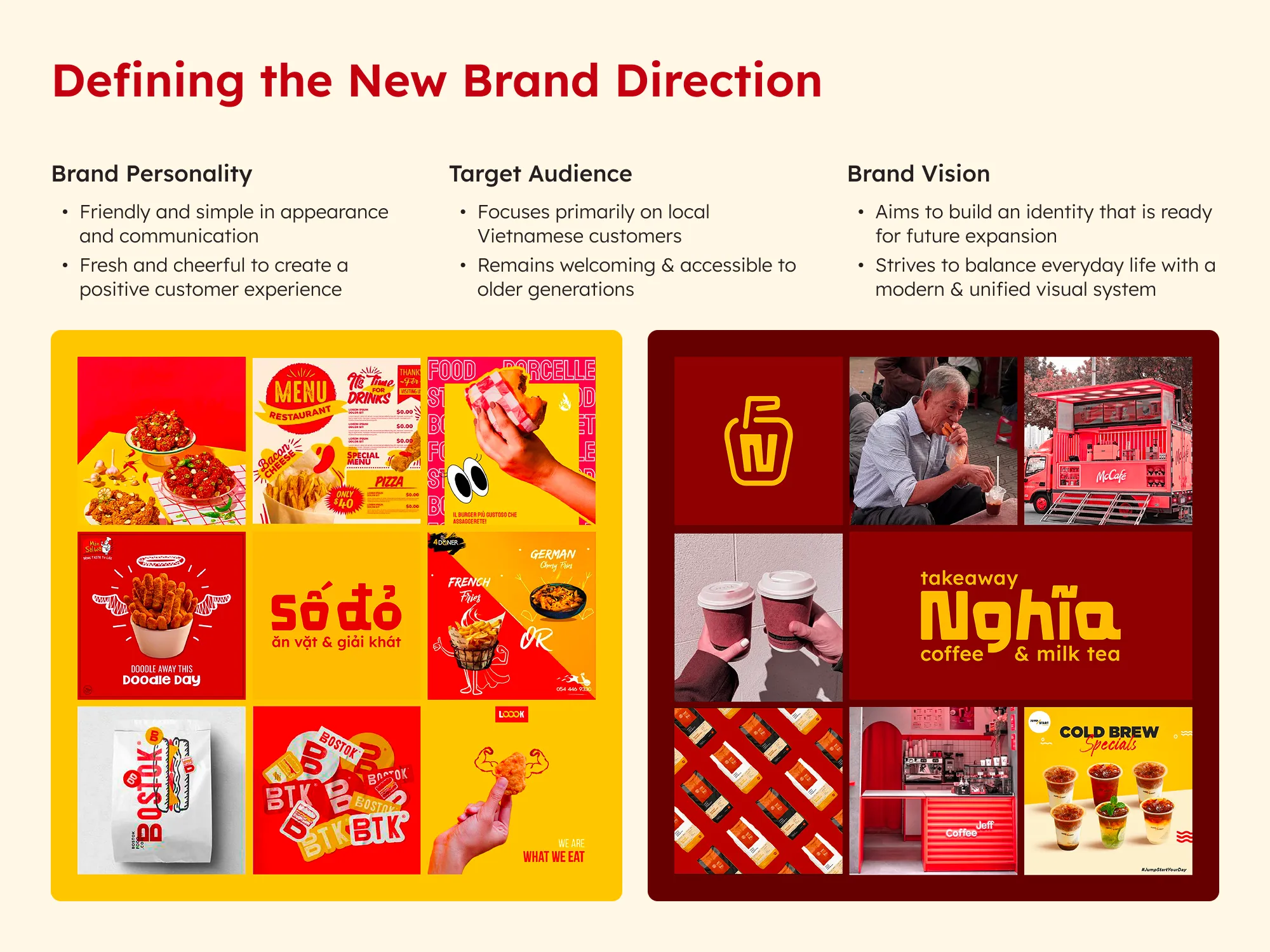
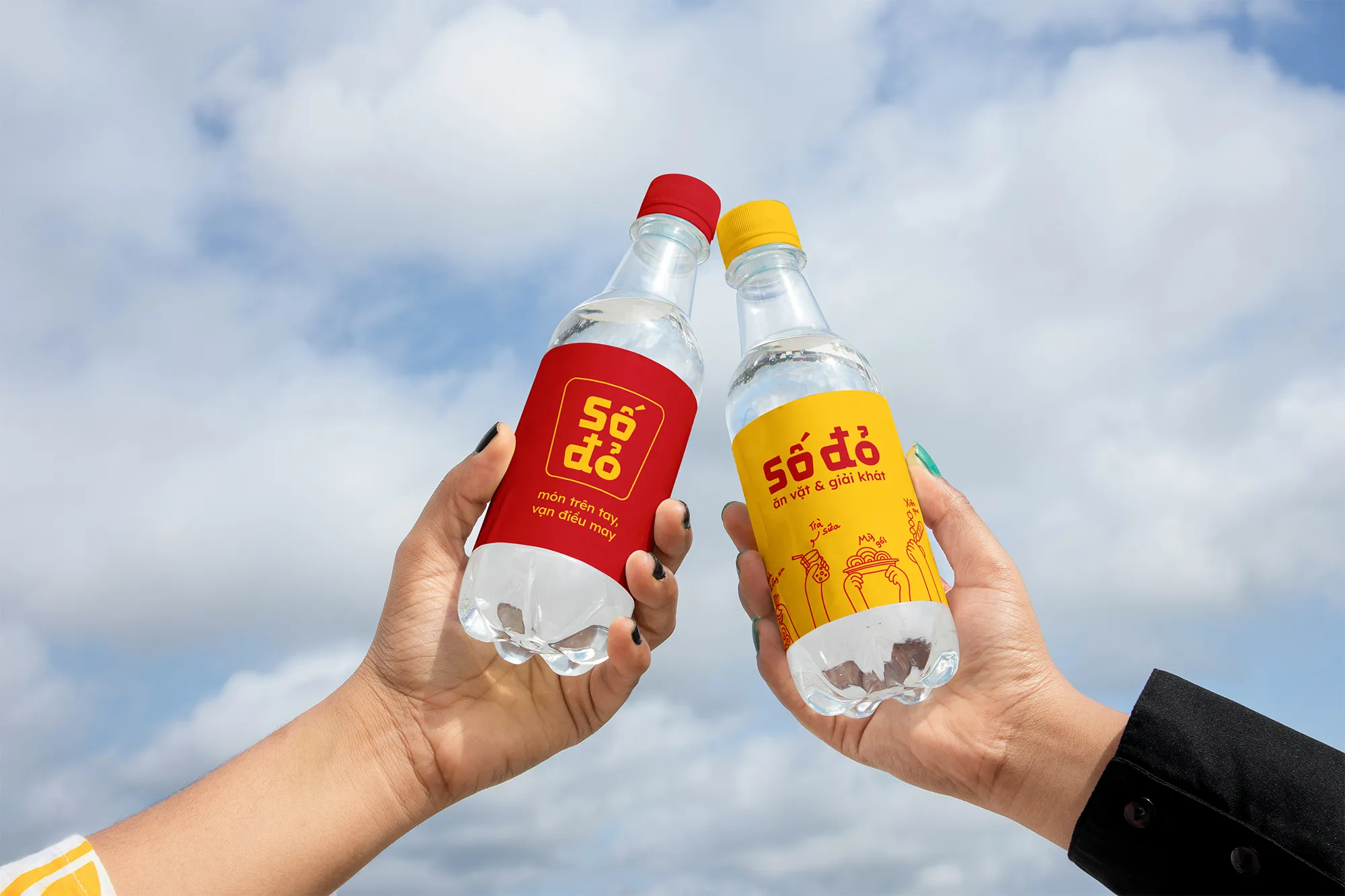
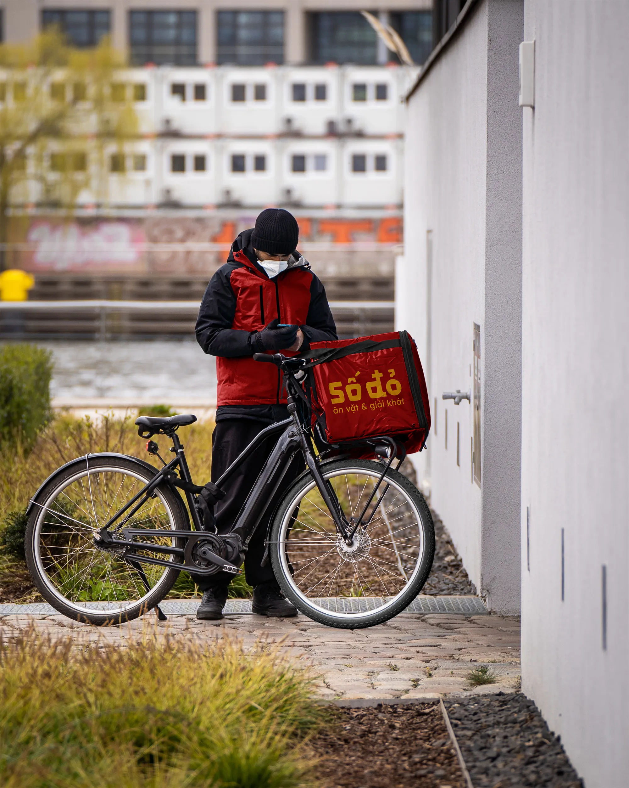
Số Đỏ and Nghĩa Coffee operate as a duo of street food and beverage brands aimed at delivering fast, affordable treats with a local touch. The rebranding brings both under one flexible design concept, developed to appeal to younger audiences while supporting future growth.
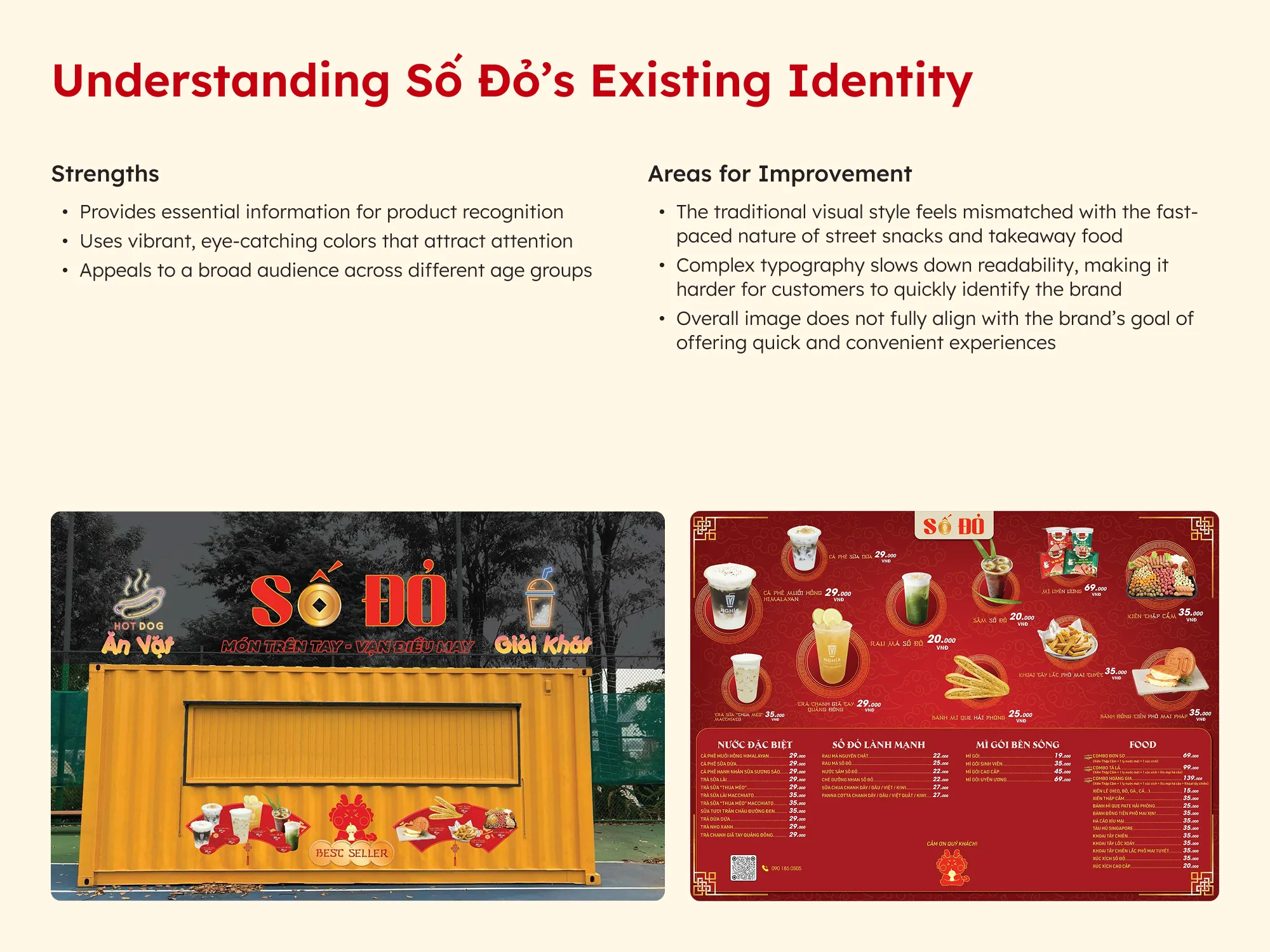
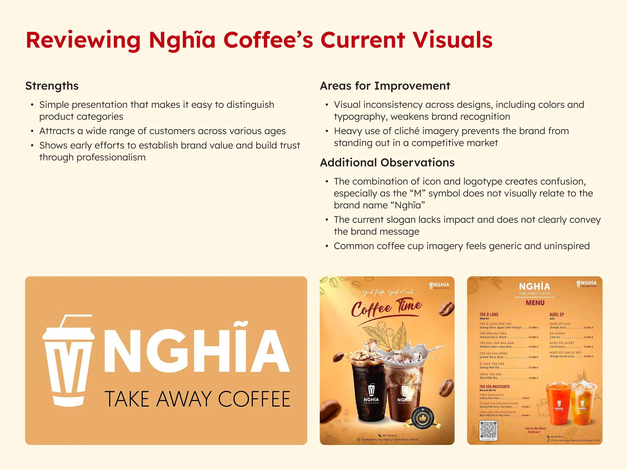
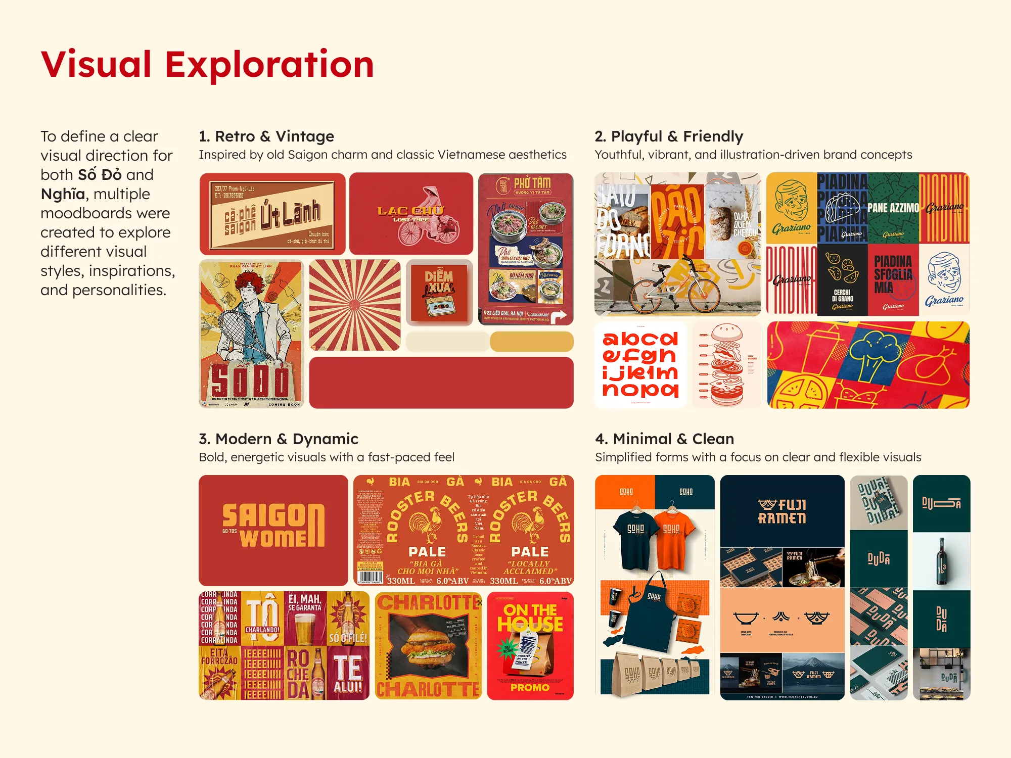
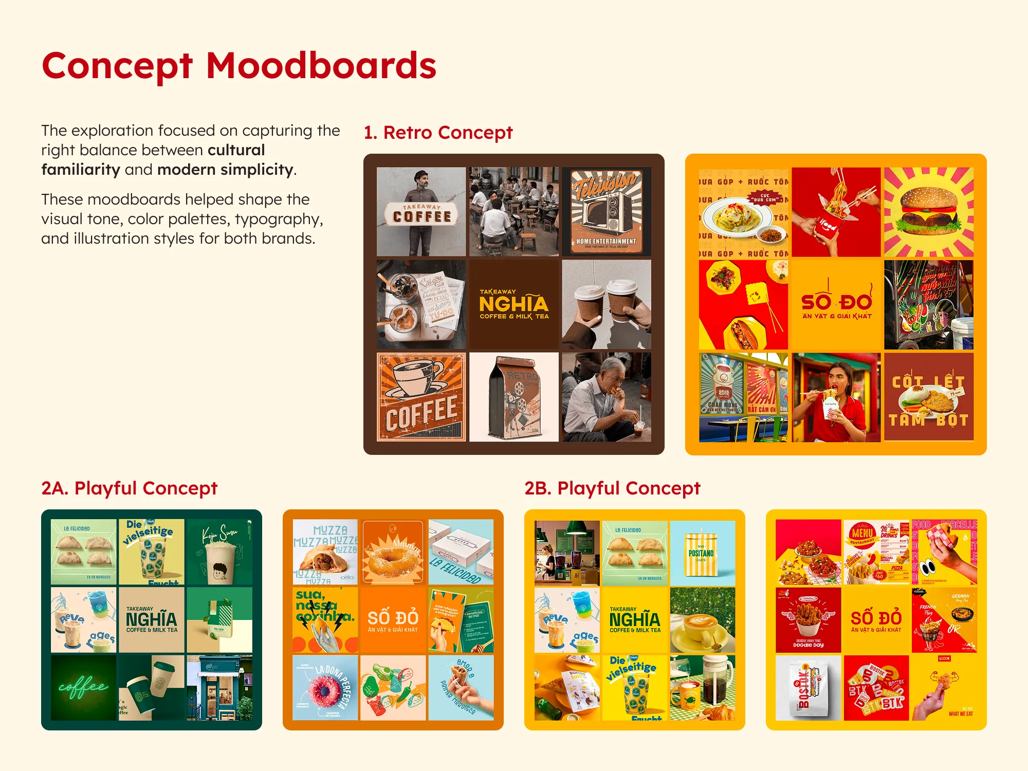
The rebranding required resolving visual inconsistency and outdated styles across two brands with different starting points. The goal was to create a system that felt modern yet familiar, flexible enough to evolve, and clear enough to compete in a saturated F&B market.
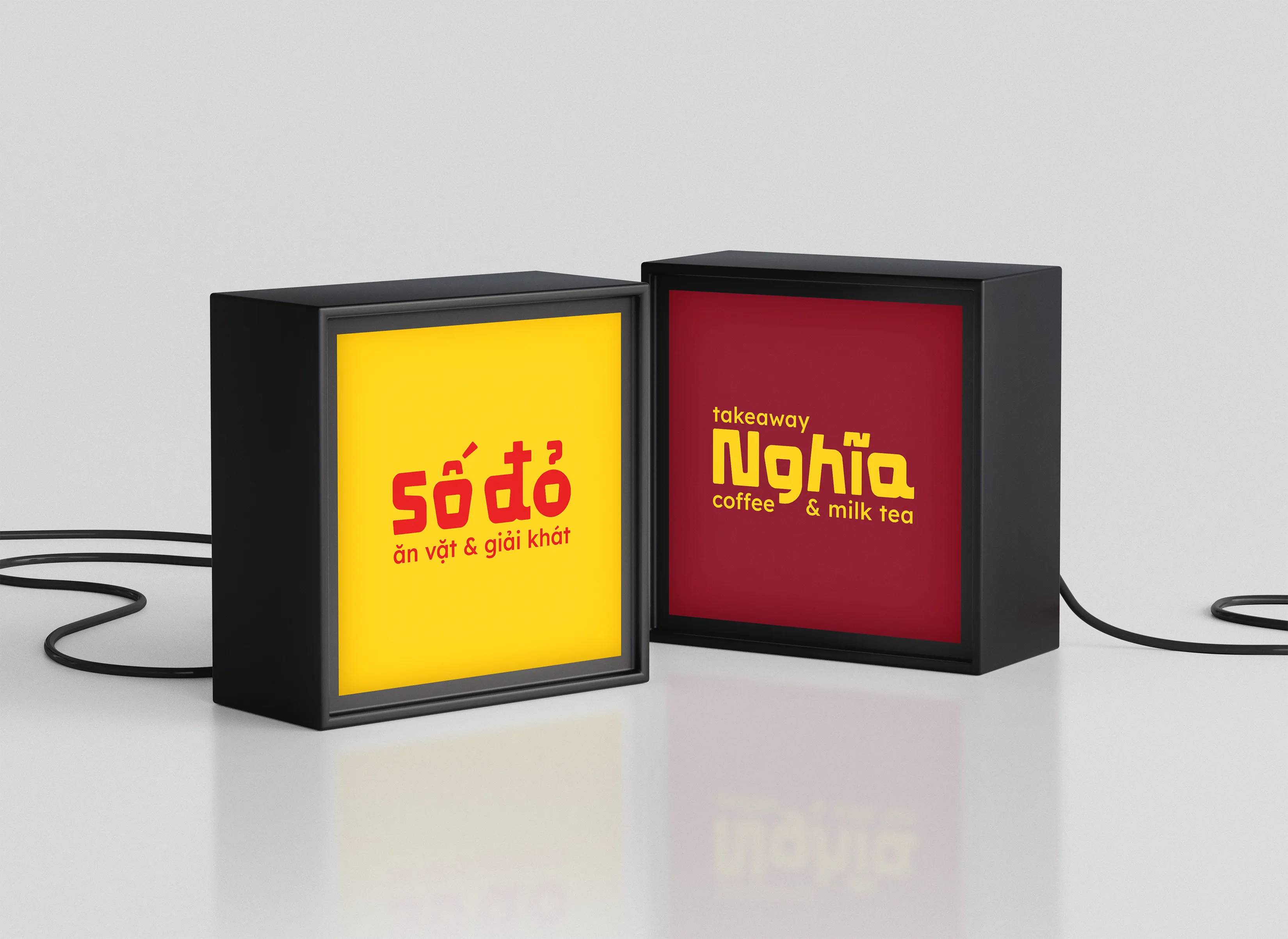
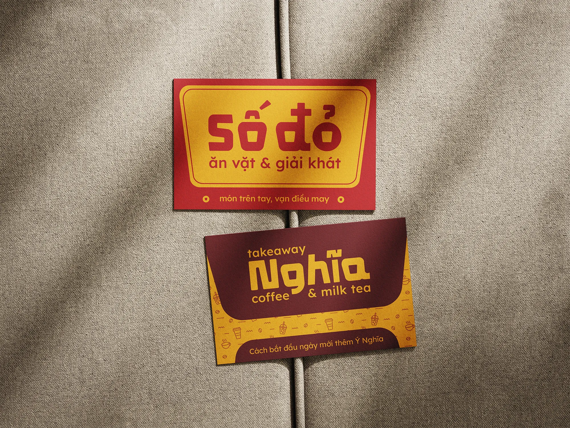
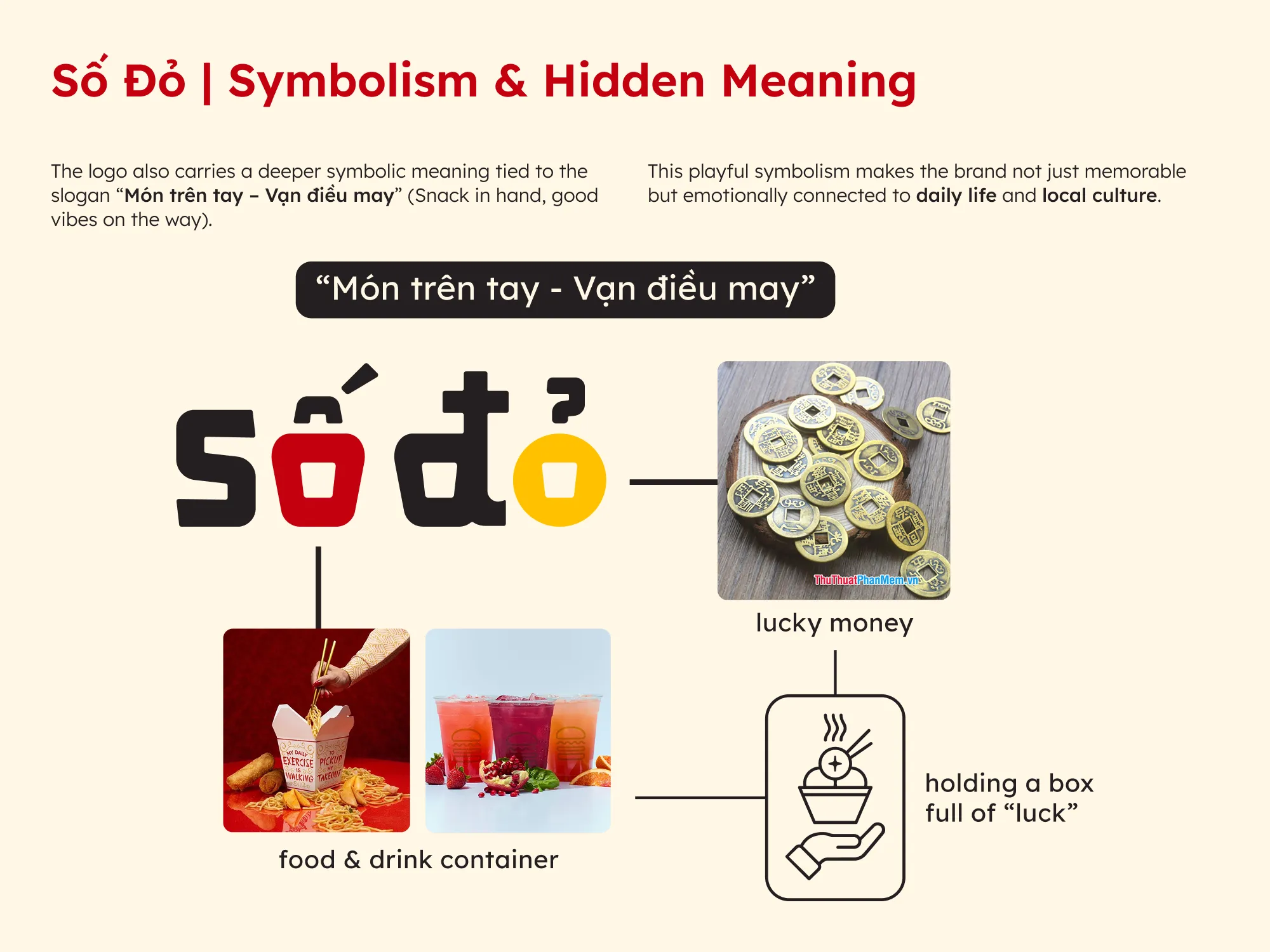
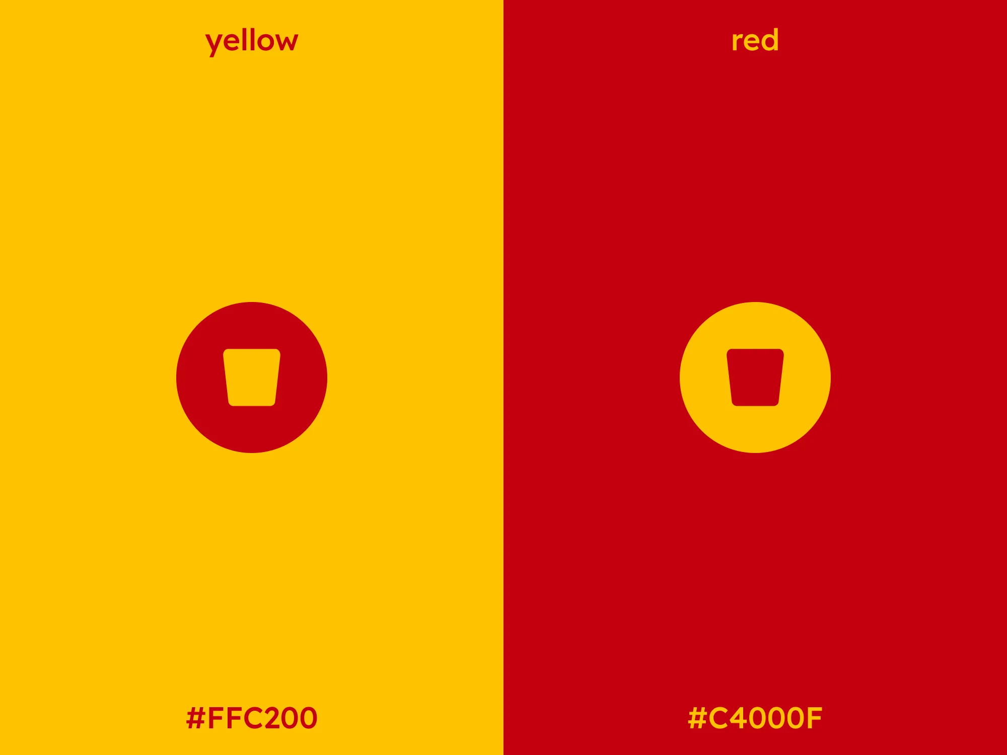
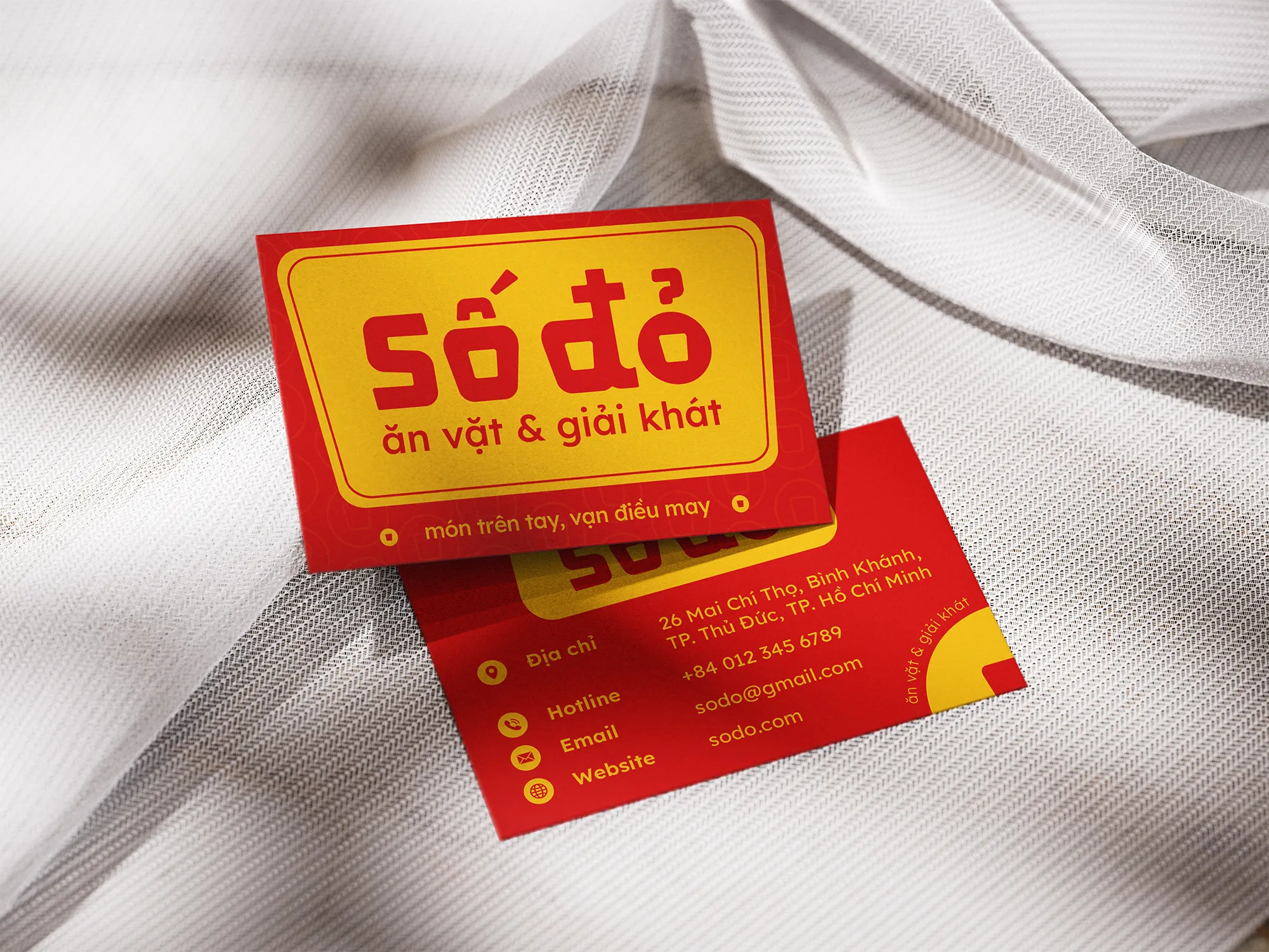
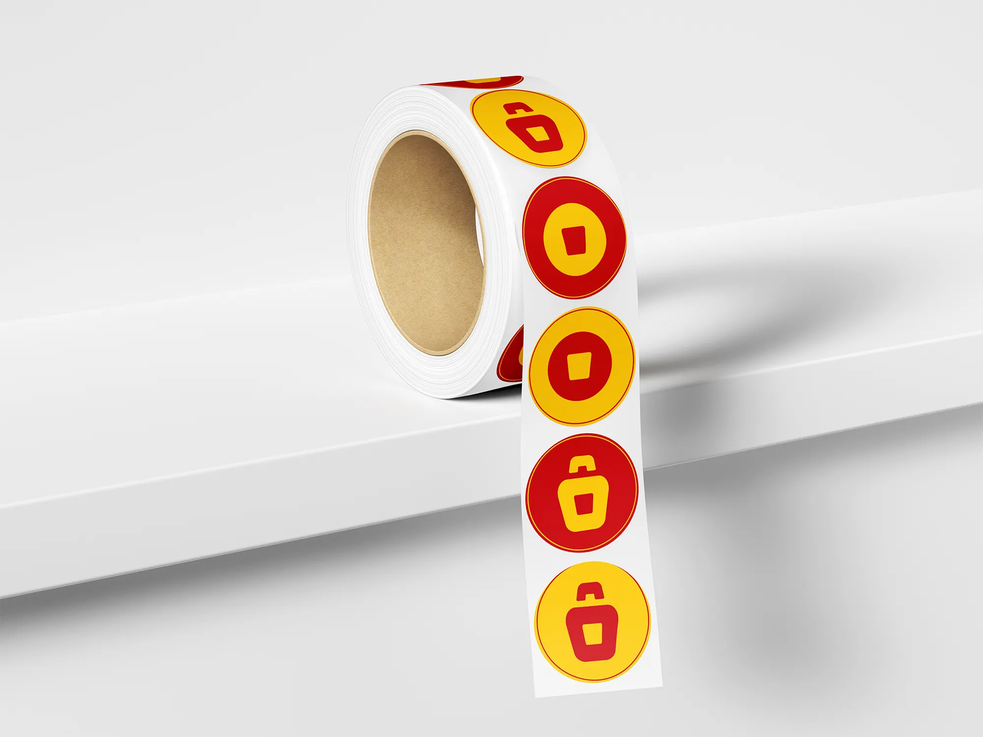
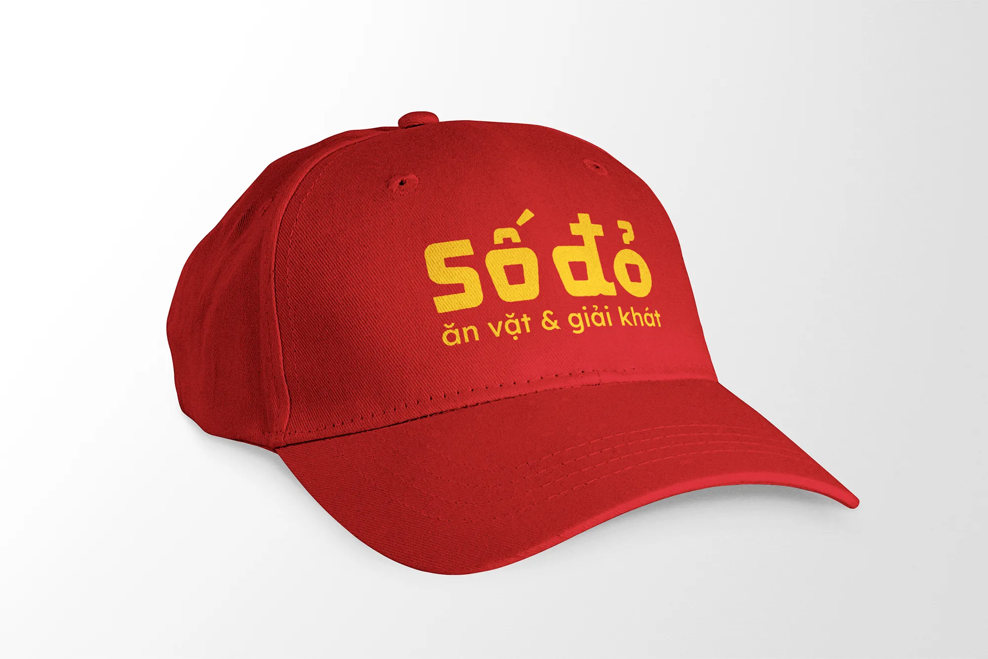
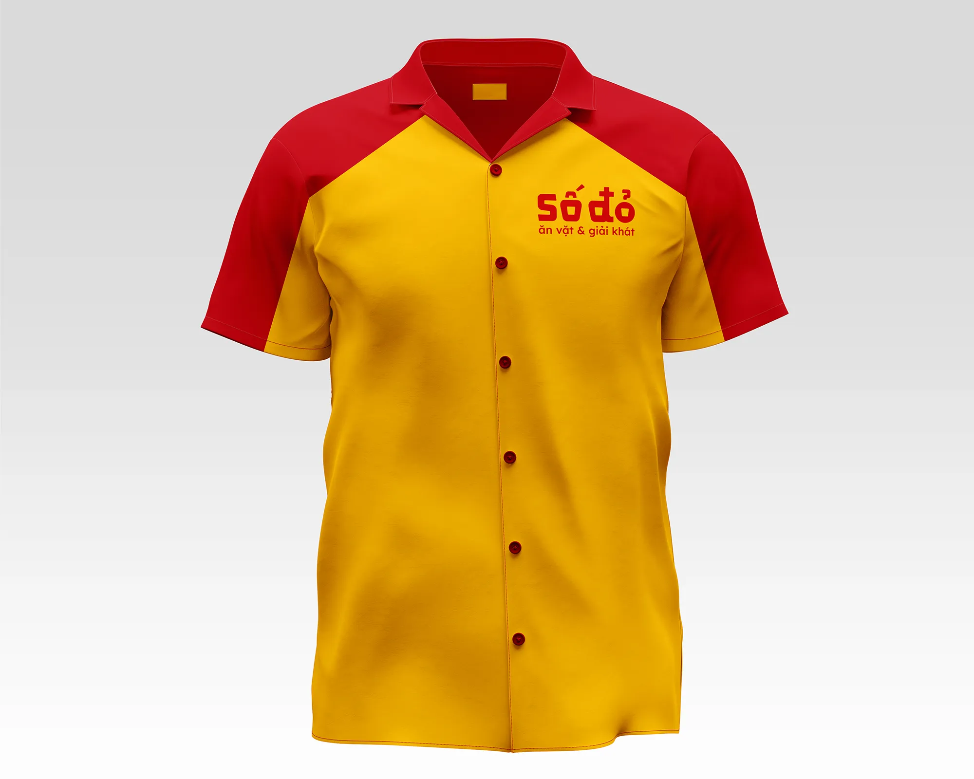
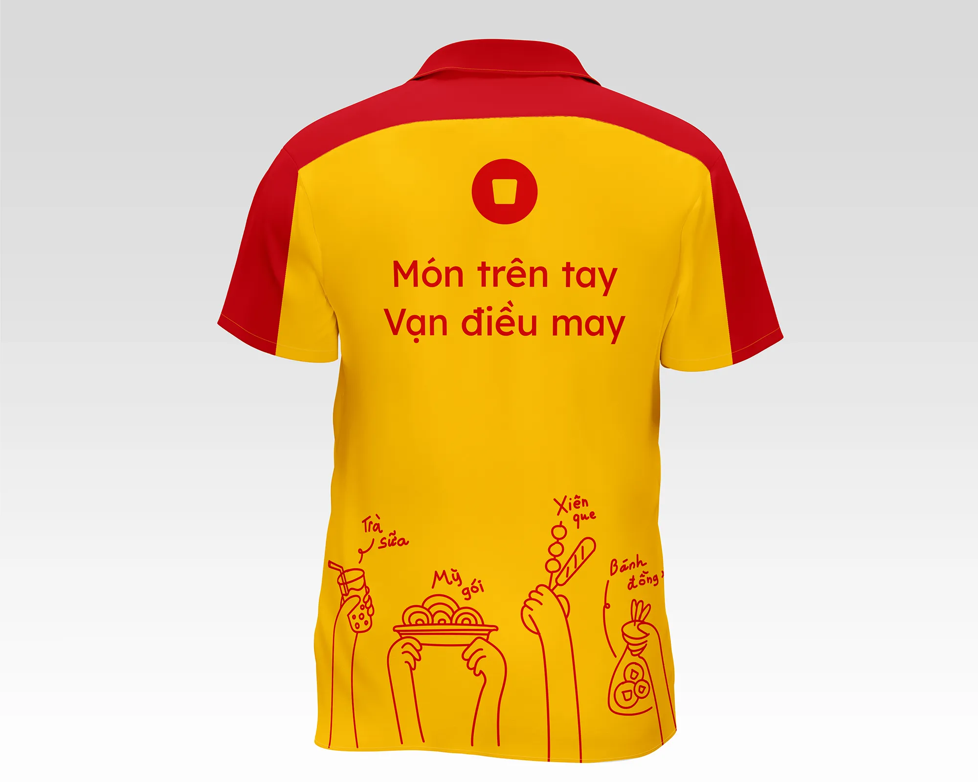
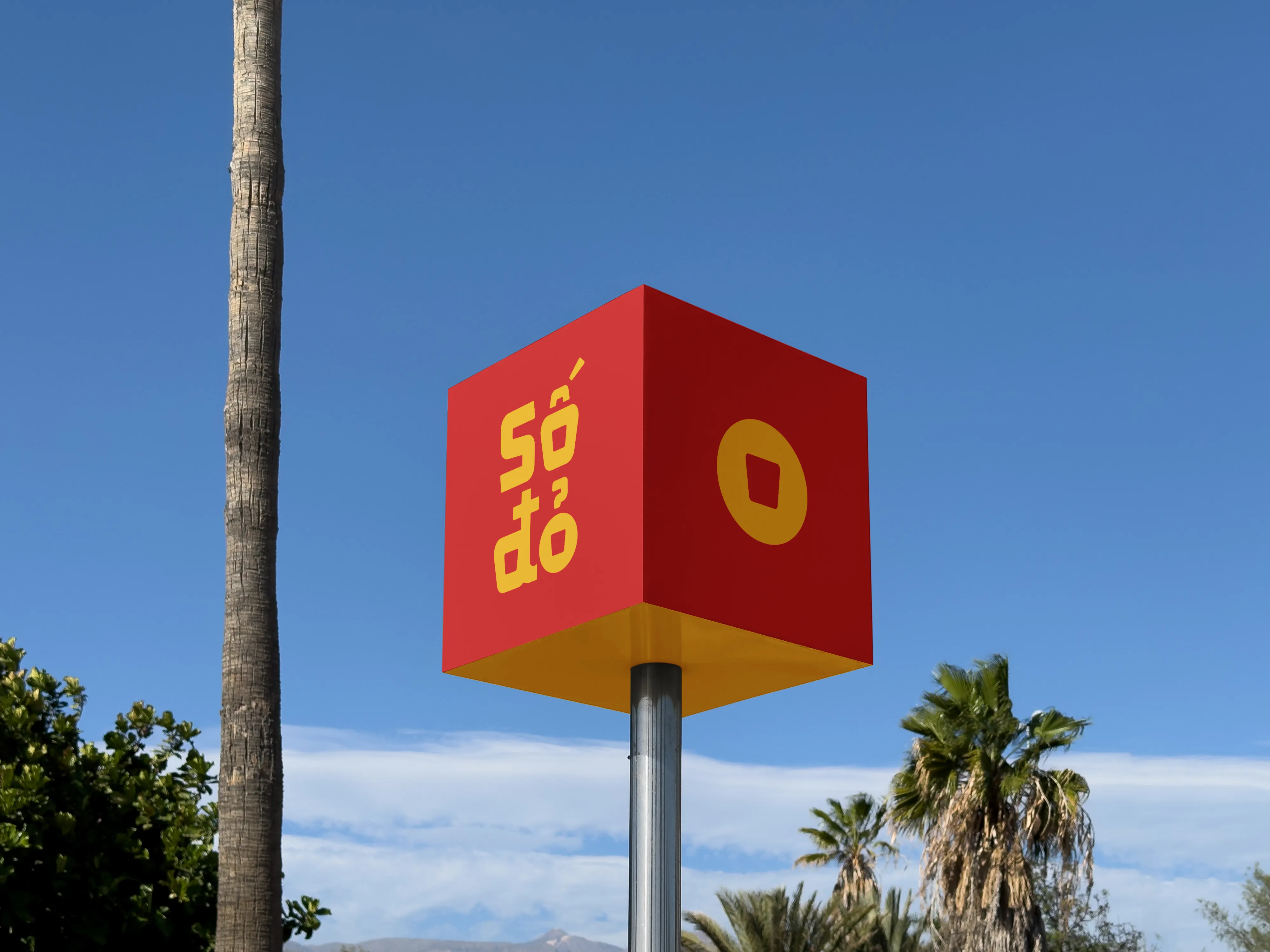
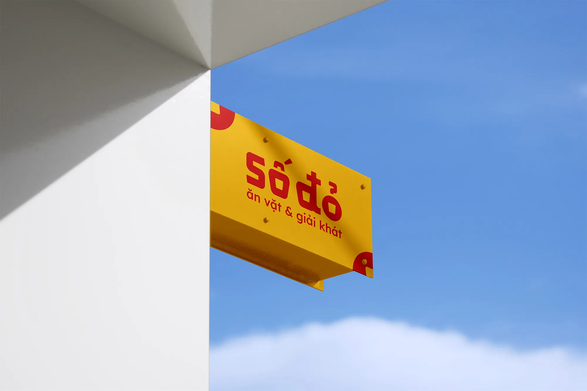
The new identity for Số Đỏ captures the energy of Vietnamese street food through bold shapes, friendly colors, and familiar forms. Its logo is built from a soft trapezoid, reflecting packaging shapes like snack boxes and takeaway cups. The typography takes cues from old Vietnamese book covers, reimagined in a way that feels both nostalgic and quick to read.


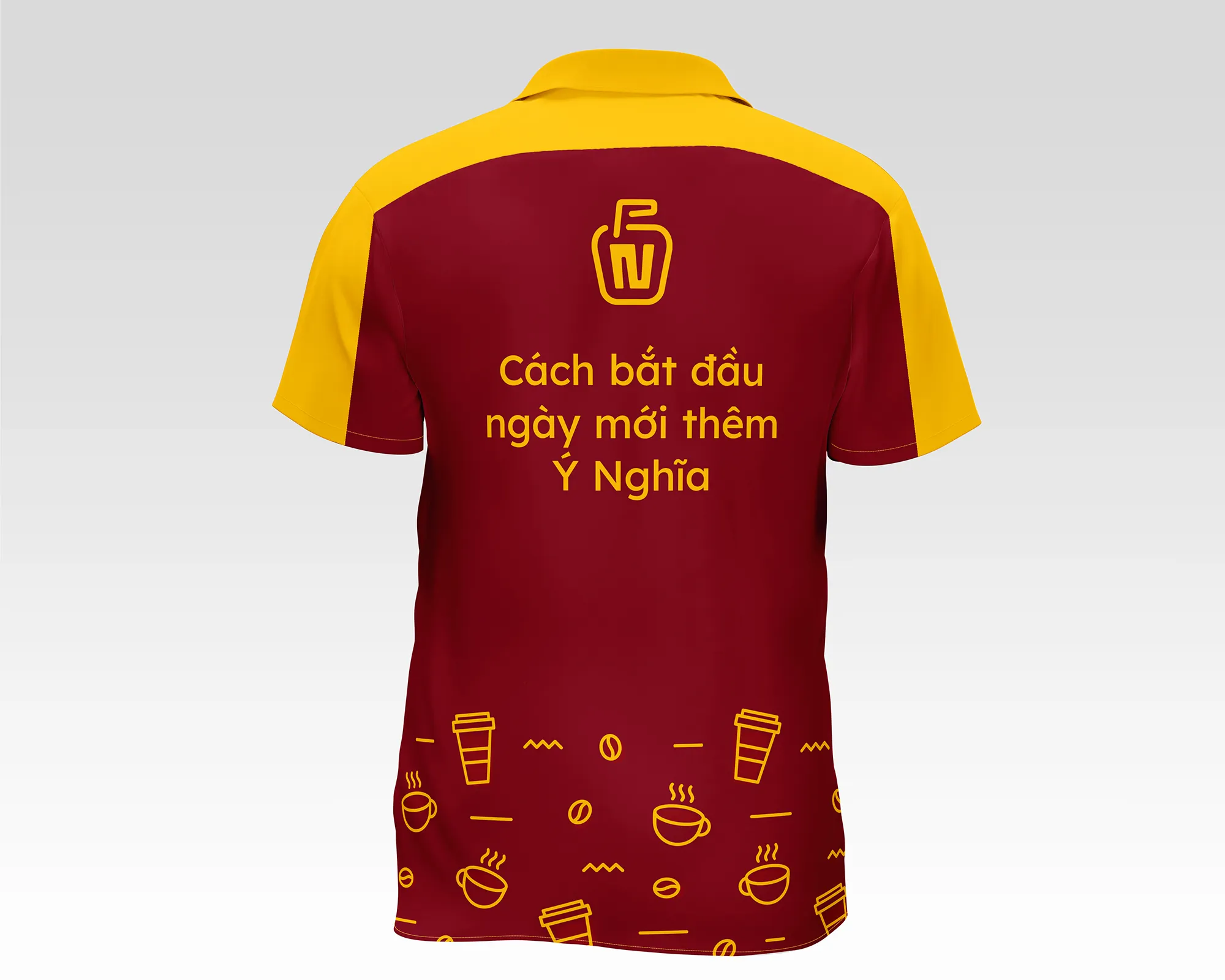
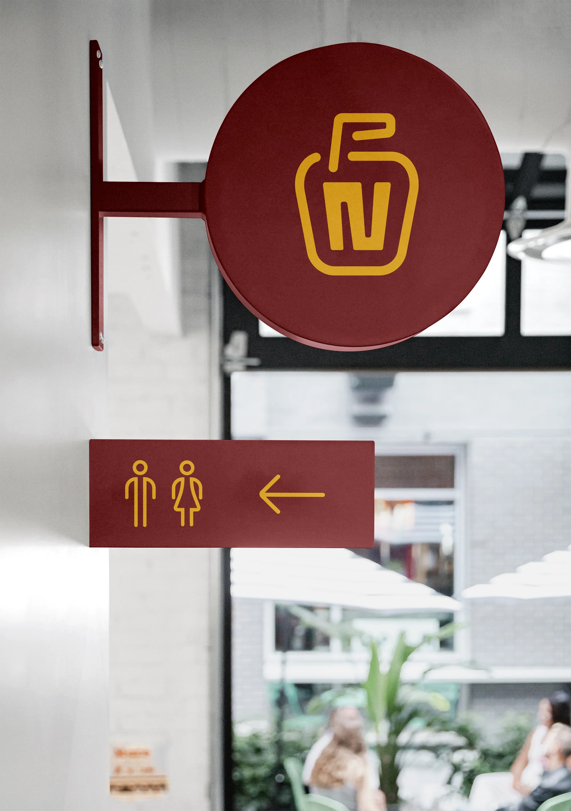
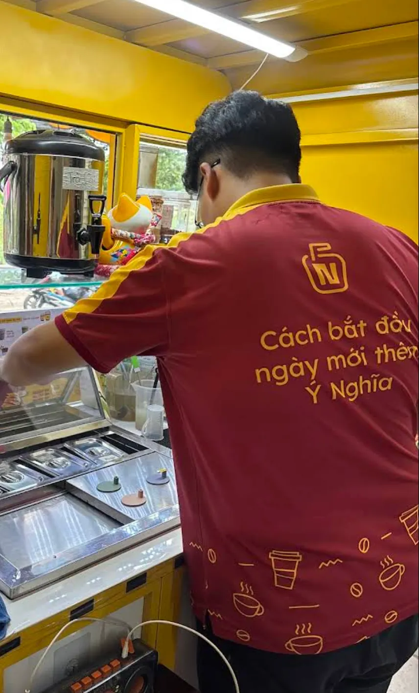
Nghĩa Coffee was redesigned using the same visual foundation as Số Đỏ, creating a natural link between the two while allowing for a calmer tone. The logo shares the same core shape and color but introduces refined details that speak to the relaxing pace of coffee culture. The design avoids predictable coffee icons and instead focuses on clean structure, clarity, and friendliness.